Nano Meikki – Flyer for Business Clients
About the Client
Nano Meikki provides car care services with a modern and polished approach. The company’s visual identity combines a premium feel, clarity and an approachable service attitude. The same atmosphere needed to be reflected in the printed materials as well: high-quality, attractive and fully aligned with the brand.
Starting Point
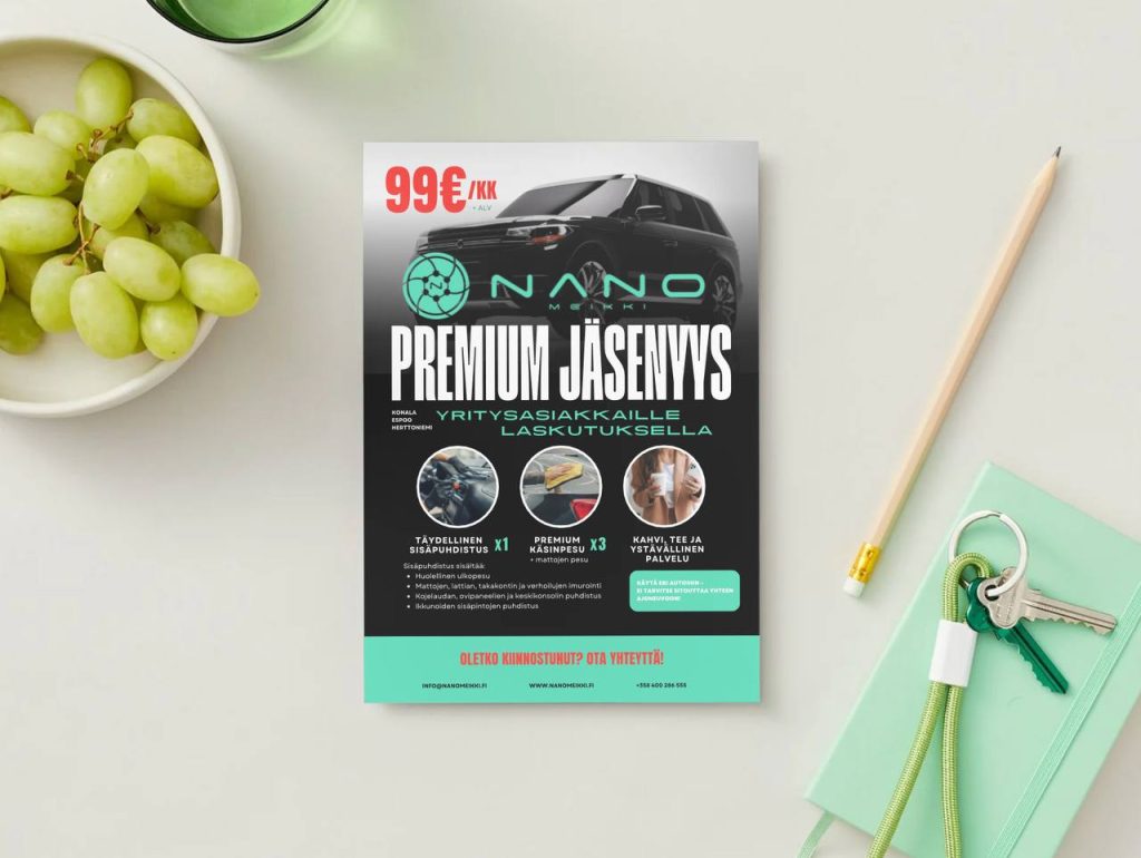
Nano Meikki needed a flyer aimed at business clients that would present its premium membership clearly and attractively. The material had to work as a strong sales presentation, helping the service offering, price and benefits become clear at a glance. The flyer also needed to stand out visually and immediately communicate that this is a more polished and premium service than an ordinary car wash offer.
A premium sales flyer for business clients
Clear message + strong visual identity
Goal
The goal was to design a flyer that looks premium, attracts attention quickly and clearly communicates that the offer is a premium solution tailored for business clients. At the same time, the material needed to present the service content, pricing and key benefits in a straightforward way without forcing the reader to search for the most important information.
Task
Our task was to design the flyer’s full visual identity and content structure from scratch. We built the overall concept so that it supports Nano Meikki’s brand, brings the strongest selling points forward clearly, and makes the service easy to understand even for a busy business decision-maker.
Design and Execution
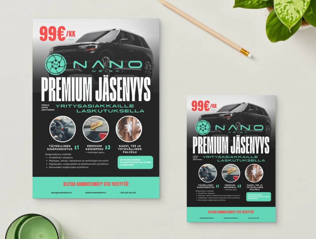
In the flyer design, we combined visual impact with clear information. The dark background, turquoise brand elements and strong contrasts created a modern, premium and easily recognizable look. This visual direction supports the Nano Meikki brand and gives the service a high-quality impression even before the viewer starts reading the details.
The headline structure was intentionally made strong. “Premium Membership” works as the main message from the first second, and the price was placed prominently to create instant interest. After that, the eye is guided directly to who the service is for and how it works. This way, the core message is easy to understand without unnecessary effort.
The flyer also highlighted the concrete benefits of the service. Icons and imagery made the content easier to approach and quicker to understand. Interior cleaning, premium hand wash and friendly service were not left as plain text only, but presented visually in a way that makes the service feel more real and more attractive.
One of the strongest solutions in this project was emphasizing flexibility. The material clearly communicated that the service is not tied to just one car, but fits the practical needs of business clients as well. This is an important message for an audience that often values efficiency, flexibility and ease of management when making purchasing decisions.
A clear call to action with contact details was added to the bottom of the flyer. This completed the sales structure of the piece: first capture attention, then explain the service, and finally guide the viewer to take action.
Results
A professional and sales-driven flyer that combines a premium look with a clear message
1
The flyer presents the service content, pricing and benefits quickly and in an easy-to-understand way.
2
The visual identity supports Nano Meikki’s brand and strengthens the premium impression.
3
The overall concept works both as presentation material and as an active sales tool in business client acquisition.
4
The result became more than just a printed product — it functions as a practical marketing tool.
Does your business need a flyer that looks great and also sells?
We design brochures, flyers and marketing materials that combine strong visual identity, a clear message and content built for the right audience. Let’s create materials that also support sales.
Other Projects