SK Katsastus – Business Card Design
About the Client
SK Katsastus is a modern and approachable vehicle inspection company whose services are built around smooth processes, clarity and customer-friendliness. The visual identity of the business needed to feel professional while also staying fresh, modern and easily recognizable even in smaller printed materials.
Starting Point
SK Katsastus needed a business card that would support the company’s brand and also work effectively in real use. The card had to look good, include a large amount of essential information, and leave customers with a clear, modern and trustworthy impression of the company. The goal was not to create just a standard contact card, but a printed piece that supports visibility and strengthens the overall brand experience.
A business card that combines practicality, clear information and a strong brand identity
Brand + usability
Goal
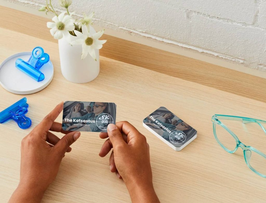
The goal was to create a business card that would not simply serve as a holder for contact details, but become part of the company’s marketing and visual identity. At a glance, the card needed to communicate that SK Katsastus offers a wide range of services, operates in several locations, and makes the customer experience clear and easy.
Task
Our task was to design the full visual concept of the business card from scratch. We built the layout so that it combines clear information, strong readability, a recognizable brand look and modern elements such as a QR code and social media presence. The aim was to fit a lot of useful information onto the card without making the result feel crowded or confusing.
Design and Execution
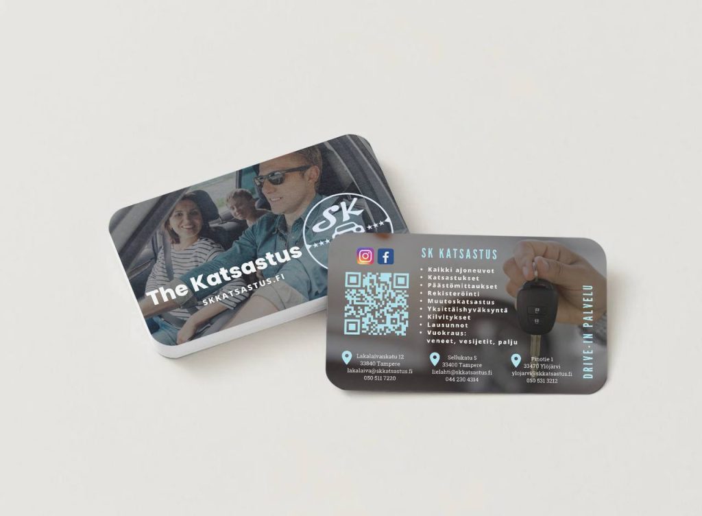
In designing the business card, we wanted to show that even a small printed product can say a lot about a company. The visual direction used SK Katsastus’ dark and stylish brand look, refreshed with light blue details. This created a modern, clean and professional feeling while keeping the card easy to read.
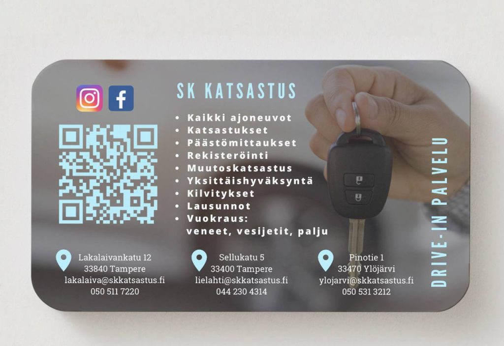
One side of the card was designed as a clear information section including the service list, contact details for different locations, a QR code and social media channels. This made the card genuinely useful and practical without making it feel overloaded. The QR code helps customers access information quickly, while the social media elements add a modern and approachable touch to the overall look.
On the visual side of the card, we focused on the impression created for the customer. The imagery connected to family life and driving supports the SK Katsastus brand well and communicates that the service is designed for everyday drivers, families and people who value convenience in daily life. This makes the card feel warmer and more approachable than a traditional technical business card.
In addition, the “Drive-in service” message and the car key visual reinforce the idea of easy and effortless service. As a result, the card does not only tell who the company is — it also communicates what the service feels like from the customer’s point of view.
Results
A polished and practical business card that strongly supports the SK Katsastus brand
1
The card combines a large amount of information into a clear and easy-to-read format.
2
The overall design supports the company’s visual identity and builds trust at first glance.
3
The card works well in real customer meetings and as part of the company’s overall visibility.
4
The final result is more than a standard contact card — it functions as part of the company’s marketing and brand experience.
Do you want a business card that looks great and works in practice?
We design printed materials that are not only visually polished, but also clear, practical and memorable. Let’s create materials for your business that truly support your brand.
Other Projects