Gift Cards for Three Target Groups – Viron Herkkukauppa
About the Client
Viron Herkkukauppa offers treats, gift ideas and attractive finds for both everyday life and special occasions. The brand focuses on experience, visual appeal and ease of purchase. Its products and materials are meant to look inviting, feel gift-ready and leave a positive impression even before the actual purchase is made.
Starting Point
Viron Herkkukauppa needed a gift card concept for three different target groups based on the client’s wishes. The goal was to create separate visual versions for women, men and a neutral option, so the gift cards would suit different gifting situations while still clearly belonging to the same brand family.
Three different gift cards with one recognizable brand identity
3 target groups
Goal
The goal was to design a gift card series where each version speaks to its own target audience while all of them still look like part of one cohesive system. The gift cards needed to feel attractive, gift-ready and also make the buying decision easier through a visually clear and appealing design.
Task
Our task was to design the full visual identity of the gift card series from scratch. We created a specific mood, colour palette and visual approach for each target group while making sure the overall result stayed consistent, recognizable and aligned with the Viron Herkkukauppa brand.
Design and Execution
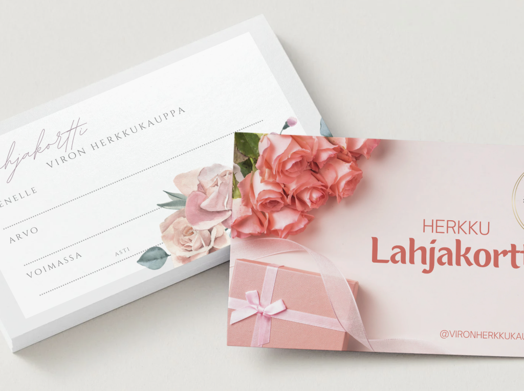
The most important part of this project was understanding the target audience. For the women’s gift card, we created a soft, delicate and elegant look with floral elements, gentle tones and a gift-like atmosphere. It communicates pampering, beauty and the feeling of a carefully chosen present.
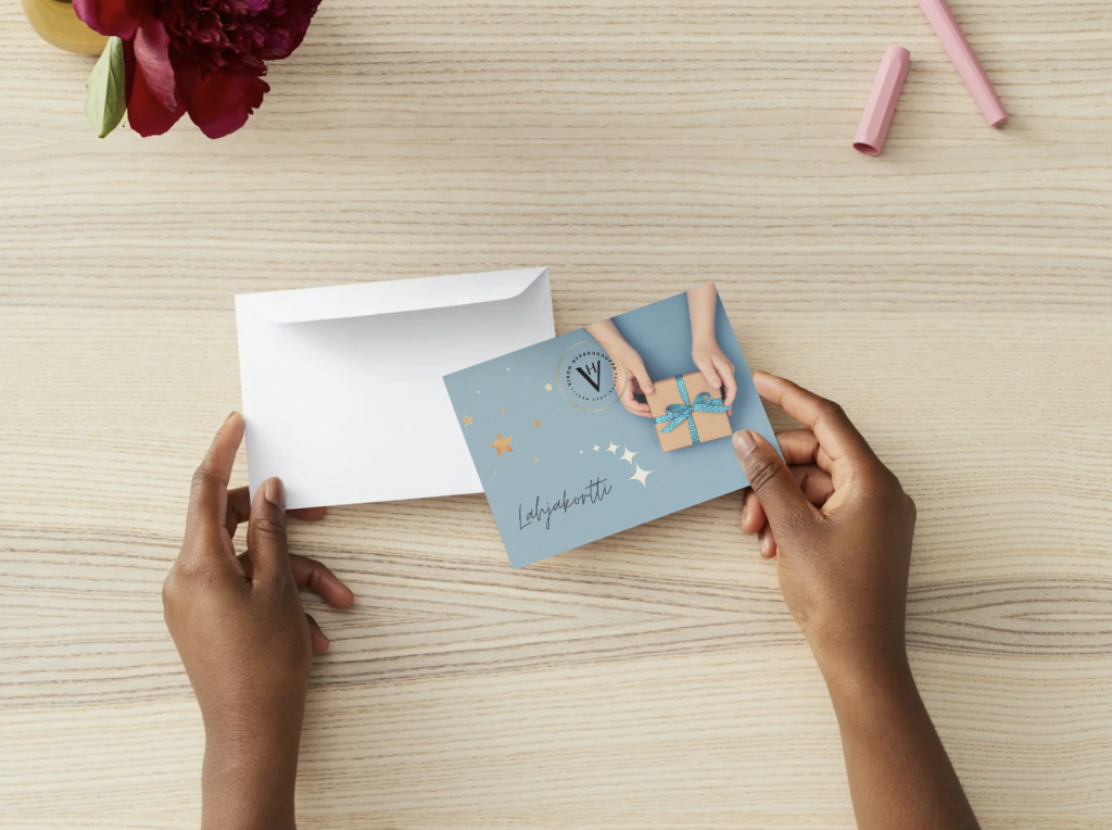
For the version aimed at men, the design was built to feel calmer, clearer and slightly more minimal. A blue-toned colour palette, clean composition and gift-oriented imagery make it stylish and approachable without feeling overly decorative.
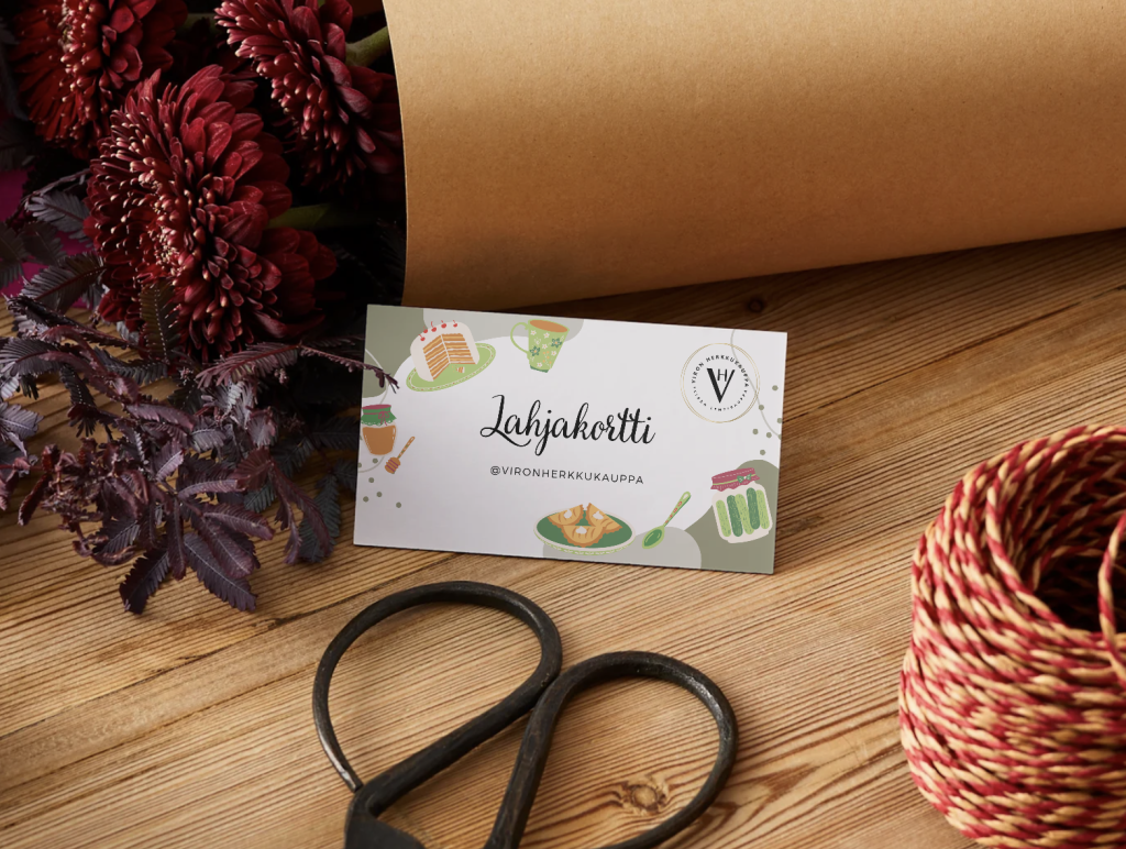
The neutral version was designed for situations where the gift should suit as many recipients as possible. In this version, the focus was on balance, clarity and the overall brand atmosphere so that the card works well for different people and a wide range of gift-giving occasions.
All three versions are tied together by a consistent structure, strong brand recognition and practical usability. The front side of each card was designed to emphasize mood and visual appeal, while the back side kept a clear space for the recipient’s name, amount, validity period and date. This made the overall concept both visually pleasing and genuinely functional.
Results
A gift card concept that addresses different target groups while strengthening the brand at the same time
1
Three tailored versions make the gift card more appealing both to the buyer and the recipient.
2
The overall concept remains consistent even though each audience has its own mood and visual emphasis.
3
The gift cards support the Viron Herkkukauppa brand and make the buying experience feel more polished.
4
The final result works both as a practical purchase tool and as part of the gift experience itself.
Does your business need materials for different target groups without losing brand consistency?
We design printed products and marketing materials that speak to the right audiences, stay visually consistent and support your brand even in the smallest details.
Other Projects