Window Branding Design for Viron Herkkukauppa
About the Client
Viron Herkkukauppa is a store offering treats, gift ideas and delightful finds for everyday life and special occasions. The brand is built around experience, visual appeal and an approachable atmosphere. That is why the exterior of the store also needed to reflect the same feeling before the customer even steps inside. The first impression had to immediately communicate that this is a cheerful, distinctive and inviting place.
Starting Point for the Window Branding Design
Window branding design became the right solution when Viron Herkkukauppa wanted to make its store more visible, more attractive and easier to recognize from the outside. The client wanted a look that would feel colourful, fun, distinctive and aligned with the brand, while also working practically within the specific window surfaces of the store. The design should not look like a separate decoration, but as a natural part of the store experience and the company’s identity.
A more visible and recognizable storefront for the street view
Brand + visibility
Goal
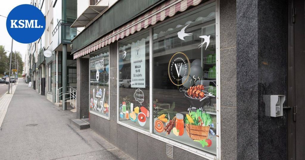
The goal was to create a storefront look that catches the attention of passers-by and immediately communicates that the shop is cheerful, delicious and full of personality. The window branding design needed to combine visual attraction, correct proportions and practical usability so that the result looks strong both from nearby and from a distance.
Task
Our task was to design the entire visual concept of the window branding from scratch based on the client’s wishes. We took into account the proportions of the window surfaces, the placement of elements, the visibility from the street, and the fact that the final result had to work both from a branding perspective and in practical production. We also made sure the concept could be executed smoothly with a production partner from printing to installation.
Window Branding Design and Execution
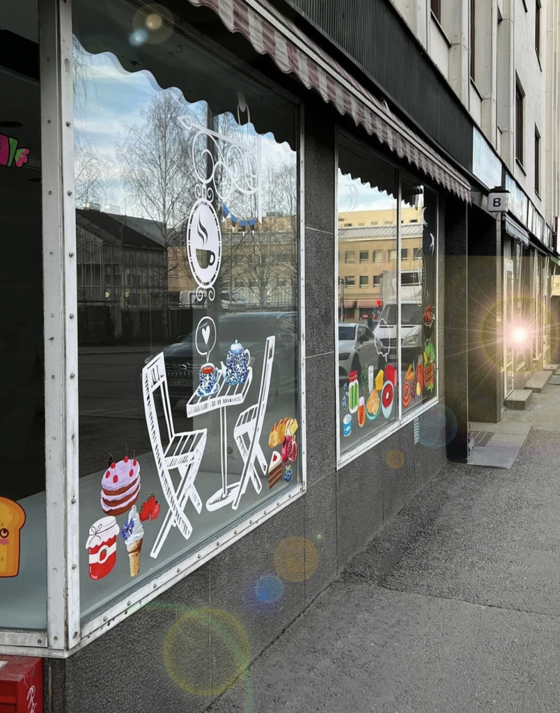
The window branding design started from the idea that the store windows need to do more than just look good. They must already tell something about the atmosphere waiting inside. That is why the overall concept was designed to support the Viron Herkkukauppa brand, stand out in the streetscape and encourage passers-by to take a second look.
The first step in the process was understanding the space itself. Long window surfaces require balanced composition so that the result does not feel too empty or, on the other hand, too heavy. The elements were carefully arranged according to the proportions of the windows. This made the window branding design much more than simply placing illustrations on glass — it became a visual solution tailored specifically to the location.
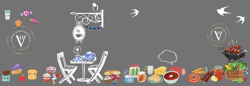
The visual style combined white linear illustrated elements with colourful treat-themed graphics. The white details added lightness, structure and breathing space, while the colourful elements brought joy, warmth and an approachable feeling. This balance made the look distinctive, full of character and still clean. The final result feels considered rather than chaotic, even though it contains many visual details.
The design also responded to the client’s wish for a fun and eye-catching appearance. Illustrations inspired by sweets, drinks and the world of the store already communicate to people on the street what kind of experience is waiting inside. The passer-by immediately gets the sense that the shop is experiential, visual and inviting. In this way, the storefront does not simply decorate the space — it actively supports visibility and customer attraction.
One of the strongest design decisions was the balance between bright colour and white graphical elements. If the entire window surface had been filled with strong colourful graphics, the result could have felt too heavy. Instead, the composition remains light and pleasant while still having high visual impact. This is especially important in an urban streetscape where the storefront must stand out without looking messy.
The window branding design was also approached from a production point of view. We did not stop at the concept stage, but worked together with a production partner to ensure that printing and installation could be completed accurately according to the plan. This meant that the final result matched the intended visual direction from start to finish. Good design is not only about an attractive concept — it is about creating a solution that works as a finished execution in a real environment.
The final outcome was a storefront that supports the Viron Herkkukauppa brand, improves visibility and makes the location more interesting at first glance. It is a strong example of how window branding design can be visual, practical and supportive of business goals at the same time.
Results
Window branding design gave the store more visibility, stronger recognition and a more inviting brand presence
1
The storefront became much more eye-catching and easier to recognize from the street.
2
The window branding design strengthened the Viron Herkkukauppa brand and made the atmosphere more cheerful and inviting.
3
The concept works both as a visual attraction and as a practical tool for improving visibility.
4
The solution was carried through as one coherent process from design to production and installation.
Does your business need window branding that truly stands out?
We design window branding and other visible materials so that they fit the space, support the brand and move smoothly from idea to finished execution. Well-designed window branding can make your first impression much stronger.
Other Projects